Key Takeaways
- Trends in Excel predict future values using the TREND function, revealing data insights.
- TREND function utilizes known data to create a trend line for predictions.
- You can visualize and calculate trend slopes accurately in Excel, leveraging TREND and SLOPE functions.
Trends show where a series is heading and how fast it’s moving in that direction. You can calculate and visualize a trend in Excel with the TREND function. Doing so will give you insights into your data and easily make projections.
What Is a Trend Line?
A trend is a straight line indicating whether data increases or decreases over time. It’s often applied to time series, where you can track a value over specific time intervals.
The trend line serves as a visual representation of this trend, showing the general direction of your data. It’s rarely a perfect fit for all values in a series unless they’re already aligned in a straight line. Instead, it’s the best possible approximation, giving you a clear sense of the overall movement.
One of the most practical uses for trend lines is prediction. By extending a trend, you can forecast future values. This is where the slope of the line becomes essential—it shows the speed and direction of the trend. However, calculating trends manually is tedious and, of course, prone to human error. That’s why Excel’s TREND function is invaluable.
What Is the TREND Function in Excel?
TREND is a statistical function that uses your known data (Xs and Ys) to create a trend line and predict future values. Its syntax is straightforward:
=TREND([known_Ys], [known_Xs], [new_Xs], [const]) The first two arguments, known_Ys and known_Xs, are the data you already have. new_Xs is the data you want to predict and calculate a trend for. The const argument defines whether to include the intercept (b) in the trend line equation (y = ax + b). If set to TRUE or omitted, Excel will calculate it; if set to FALSE, it assumes no intercept.
The TREND function analyzes past data and observes a series’ past performance. On the other hand, the FORECAST function predicts a series’ future performance. However, both use similar algorithms, meaning they yield identical results for time series. As a result, you can use both to
interpolate data in Excel
.
How to Use the TREND Function in Excel
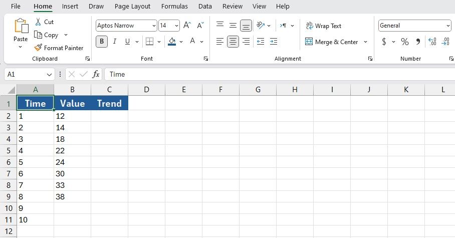
To better understand TREND, let’s go through an example. Suppose you have eight known Y values (1 to 8) and corresponding X values (also 1 to 8). You’re missing values for times 9 and 10, and you want Excel to project them.
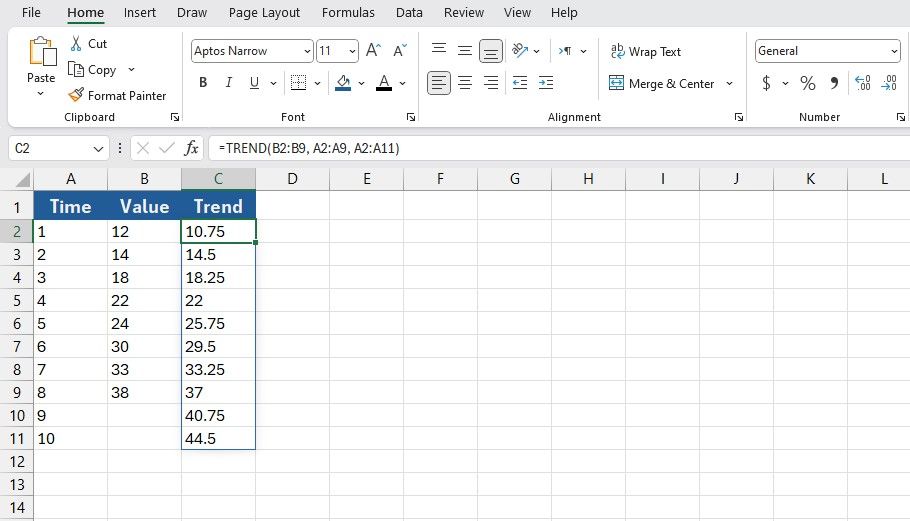
First, click the cell where you want to display your new Ys (C2 in this example). Then, type the formula below in the formula bar:
=TREND(B2:B9, A2:A9, A2:A11) This formula summons the TREND function and feeds cells B2:B9 as the known Ys. Then, it feeds A2:A9 as the known Xs. Finally, the formula tells TREND that A2:A11 will be the new Ys. These new Ys are calculated off the trend line.
Once you press Enter, Excel will fill the cells with the trend values. Observe how the projected Ys in the trend, despite being linear, are close to the known Ys.
Visualizing the Trend With a Line Chart
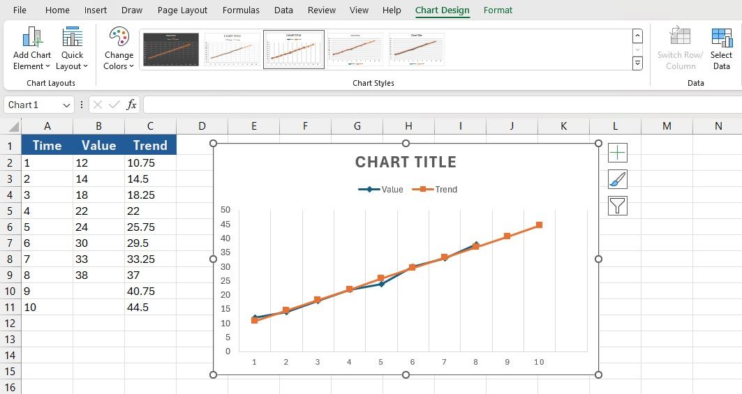
Once the projections are ready, you can visualize the trend by creating a chart. Excel offers various chart types, but a line chart is the best choice.
- Select the two columns containing the known Ys and the new Ys. In this spreadsheet, these will be columns B and C.
- With the columns selected, go to Insert.
- Click the line chart icon in the Charts section, and then select Line with Markers.
- Right-click on the chart, and from the drop-down menu, click on Select Data.
- Click Edit under Horizontal Axis Labels.
- Select the known X values. That’ll be A2 to A11 in this example.
- Click OK.
You now have a chart of your time series and their values based on the trend line calculated by the TREND function. The final chart will clearly display how the projected Ys continue from the known data based on the trend line.
The
Quick Analysis Tool
enables you to visualize your data using sparklines in a single cell, eliminating the need for a large chart range.
Calculating a Trend’s Slope in Excel
Now that you’ve created and visualized your trend, you may want to know its slope—the rate of change over time. Since the trend line is a straight y = ax + b line, you can calculate the slope (a) yourself. But this is Excel, so let Excel do the calculations.
Excel’s SLOPE function makes this simple:
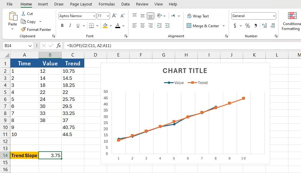
=SLOPE(known_Ys, knownXs) Let’s try to get the slope for the trend in the last section’s example. To achieve this, we’ll use the SLOPE function on the projected Ys from the TREND function. To calculate the slope, select the cell where you’d like the result to appear, and enter the formula below:
=SLOPE(C2:C11, A2:A11) This formula will indicate cells C2:C11 as the known Ys and cells A2:A11 as the known Xs for the SLOPE function. Once you press Enter, Excel will display the slope, indicating the rate at which the trend is rising or falling.
TREND gives you actionable insights with just a few formulas. But TREND is only the beginning—Excel offers a wealth of statistical tools, such as FORECAST, LINEST, and LOGEST, that you can use to dig deeper into your data and make more informed decisions.


