Excel offers a wide variety of charts and graphs, each designed to help you uniquely visualize data. But choosing the right chart isn’t always straightforward. Let’s break down the essential Excel chart types and how to use them effectively.
1 Bar Chart
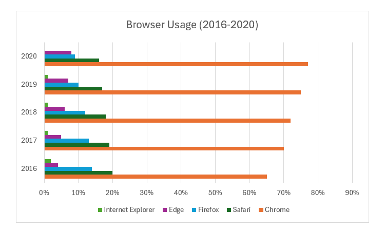
In an Excel bar chart, each data point is represented by a rectangular, horizontal bar. The length of each bar is determined by the size of its corresponding value in the data set. A bar chart is useful when you want to do a quick side-by-side comparison of categorical data (e.g., countries, colors, types of software, modes of transport, marital statuses).
You can insert a chart in Excel by selecting your dataset, heading over to the
Insert
tab, and clicking the chart type you want in the
Charts
group of the ribbon. Then, you can customize them by changing colors and layout or
adding chart elements like axis titles
.
Let’s look at an example of a bar chart showing the usage of various browsers over the years.
It’s easy to tell which browsers have gained users over time and which ones have lost by looking at this bar.
2 Column Chart
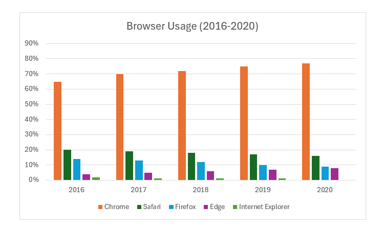
A column chart is another type of chart that compares different categories of data side by side. It is essentially a bar chart with the bars placed vertically instead of horizontally.
Using the same example of browser usage over the years, you can see that bars have just been placed vertically, but it works with the same data as the bar chart.
Bar charts are usually the go-to method for visualizing data similar to this example. However, if the category names are long, they’d be cluttered in the tiny space that a bar chart provides. In such cases, a column chart is the better choice.
3 Line Chart
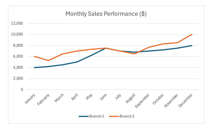
A line chart shows changes over time in a data set by connecting two data points with a line. It’s useful when you have continuous data (e.g., height, weight, temperature, and stock prices) and want to make comparisons based on upward or downward trends.
Our example shows a line chart of the monthly sales performance of two branches in a year (from January to December).
In this case, the line chart quickly tells us that Branch 1 shows steady growth throughout the year, while Branch 2 has some fluctuations.
4 Area Chart
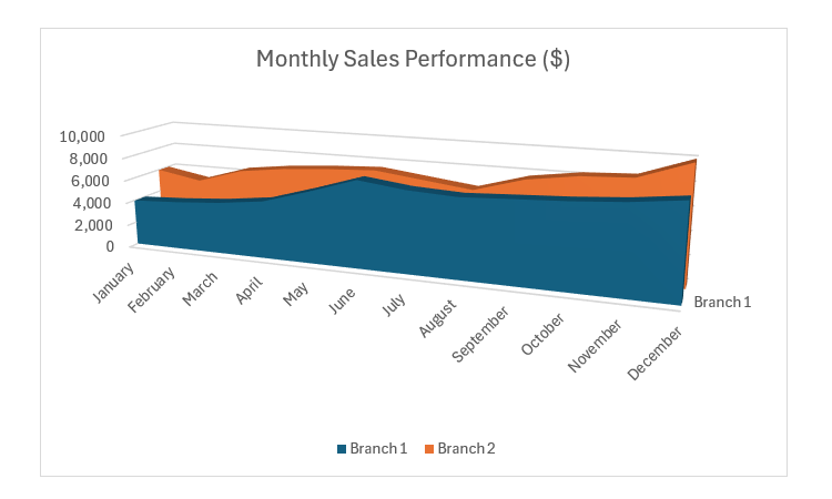
An area chart is a variation of a line chart that also shows changes over time. However, each line has a colored area underneath it, highlighting the increases and decreases in volume during that period. This makes comparisons with an area chart more striking than a line chart and gives you an idea of the area under the curve.
Using the same data as the line chart, you can create the area chart below. However, since the areas are filled, you can get a visual image of the differences between the two branches. If you want to get an exact measure, you’ll have to calculate the area under the plots with formulas.
5 Scatter Plot
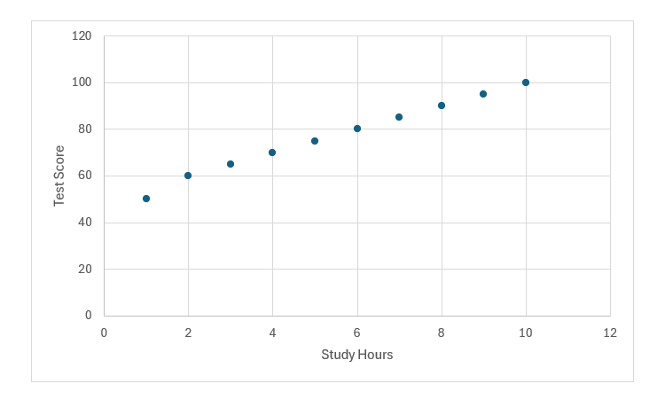
A scatter plot or bubble chart uses dots plotted on the X and Y axis to show a correlation or relationship between data points in a two-dimensional graph. If you notice a trend between two datasets and want to know how the values of one could potentially affect the other, using a scatter plot can help.
Here is a scatter plot showing a positive correlation between study time and test scores. The graph shows that the more one studies (X-axis), the higher one will score on a test (Y-axis).
The scatter plot allows you to add trend lines, which help predict data patterns and validate the dataset. A trend line is a straight line that best fits the plotted points, following the data’s general direction. If the data isn’t linear, the line takes the closest possible path.
6 Pie Chart
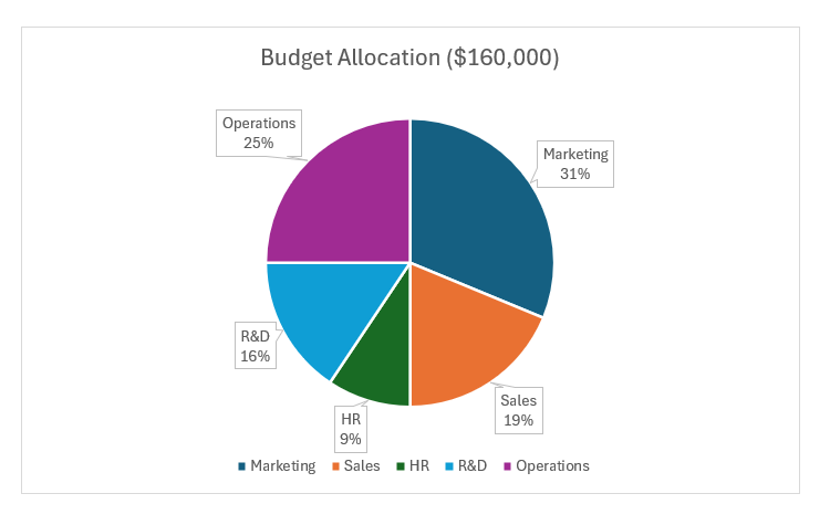
A pie chart is designed to mirror dividing a pie into slices. It is basically a circular chart where the data points are represented by sectors proportional to their corresponding value in the data set. You should use a pie chart when you want to show how each data point contributes to the whole.
The pie chart below illustrates how the total budget is distributed among company departments. A quick look reveals that marketing and operations account for more than half of the budget.
7 Histogram
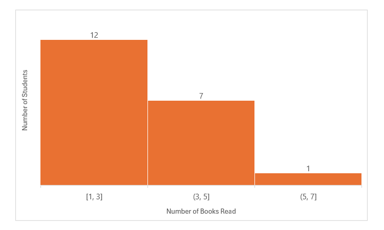
A histogram shows how grouped data points are distributed within a range. It uses a series of bars (called bins in Excel) to represent the value ranges and show how often certain values occur within them. Essentially, a histogram functions like a column chart but displays ranges of categories rather than individual ones. This makes a histogram effective for identifying which ranges have the most or least data points in a dataset.
For example, based on the histogram below, we can tell that more students read 1-3 books, with fewer reading more than that.
8 Combination Chart
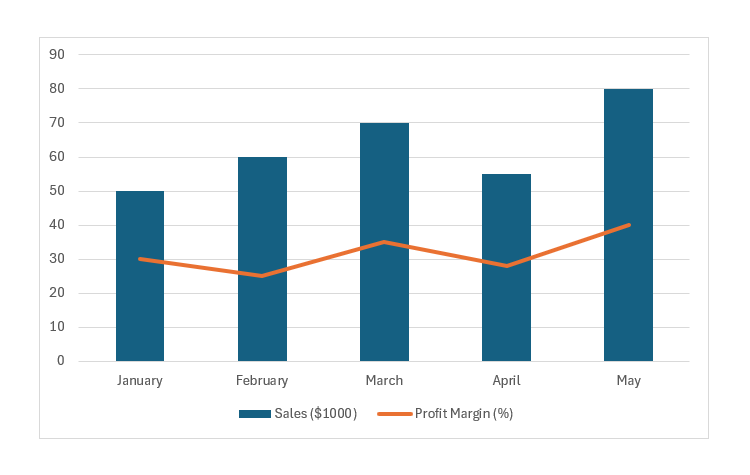
A combination chart in Excel blends two or more chart types, such as a column and line chart, into a single visual. It’s ideal for comparing datasets with different scales—like sales in dollars alongside profit margins as percentages.
This type of chart not only highlights trends and relationships between different metrics but also offers a clearer perspective by displaying all critical data in one place. It’s especially useful for spotting patterns that might be missed when viewing separate charts, making it easier to analyze complex datasets at a glance. You can easily see all key metrics at a glance since they are in one place.
Above is a combination chart showing a positive relationship between increasing sales (column chart) and rising profit margins (line chart).
Any good spreadsheet app will have a good selection of charts that you can use in various scenarios. In fact, you will find that most of the Excel charts mentioned above are also available as Google Sheets charts. Just be sure to use them in the right scenario to get the most accurate analysis!

