Key Takeaways
- Utilize Canva templates for various platforms like Pinterest and Instagram for quick and easy designs.
- Experiment with animations, text effects, and shapes to add depth and creativity to your Canva designs.
- Use high-resolution images, the correct dimensions, complementary fonts, and limited elements for visually appealing creations.
Canva is a fantastic tool for making your projects stand out, and you can try several simple things to make your designs really pop. Here are some of my top recommendations to try if you’re looking to add something extra.
1 Searching for Specific Templates
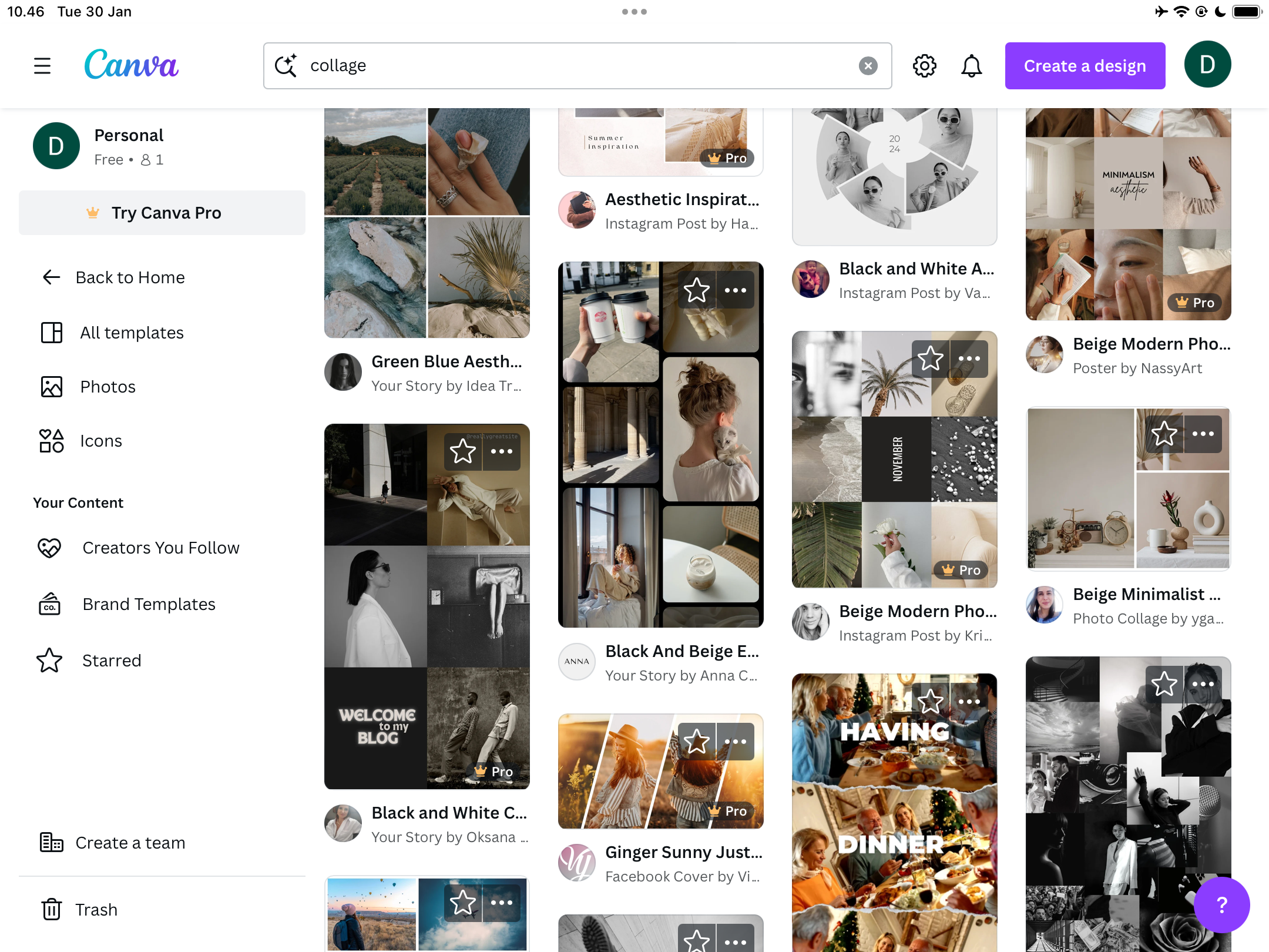
While I sometimes start from scratch in Canva, I often like using templates as a starting point for my designs. Having something to work with makes it much easier for me to think creatively, and it’s also useful if I want guidelines to work within.
You can use specific templates in Canva for Pinterest posts, Instagram Stories, YouTube thumbnails, and much more. I’ve used templates for all of these. Even if you don’t upgrade to Canva Pro, you’ll find plenty of free templates worth using and customizing.
You’ll find plenty of templates on the Canva homepage, and it’s also possible to search for some in the app. It’s even possible to create and publish your own templates in Canva if you want to get experimental.
2 Incorporating Subtle Animations
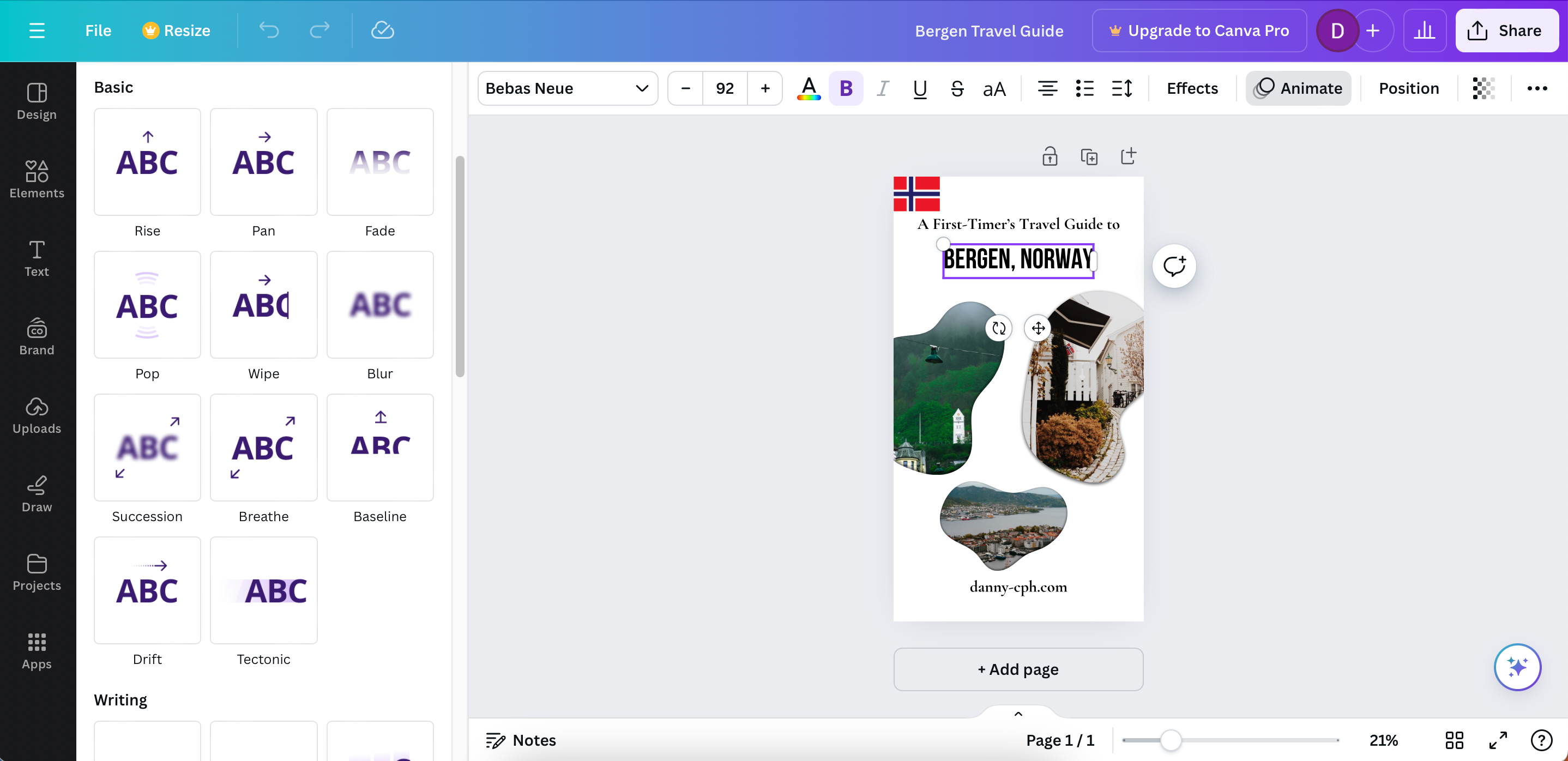
While I recommend using them sparingly, animations can add another dimension to your designs. It’s possible to customize your text in several ways, such as making the text slide along your screen from left to right (or from top to bottom). On top of that, you can make the text roll and merge—along with adding numerous other effects.
You can also add motion effects like rotation. To access each of these, select your text box and go to Animate. Here, you can add any of the effects that you think would enhance your designs.
3 Embracing Experimentation
When you’re learning any creative discipline or software, you somewhat need to stick to general rules and guidelines more closely. Doing so will help you learn the basics faster. But beyond that point, experimentation is how you really become a master. Some of my favorite Canva designs have happened completely by accident, thanks to this mindset.
You can experiment with several features in the Canva app. For example, it’s possible to use contrasting colors if you want to highlight certain design aspects. Moreover, you can experiment with text sizes in your headers, subheadings, and the main body of text.
I also recommend trying different shapes. For example, I’ve created some Pinterest pins where the images are presented in unique ways via different shapes. On top of that, I’ve also remixed templates by deleting elements I don’t like (and adding others that I do). Consider reading these tips on getting the most out of Canva if you don’t know where to start.
4 Opting for High-Resolution Images
If you don’t have the basics in place, creating high-quality designs will become needlessly difficult. And if you’re using images in your Canva designs, it’s of the utmost importance that you use the best resolution possible. The best way to achieve this is by limiting compression as much as possible (and ideally, not compressing your pictures at all).
Another good idea is to not crop your visuals in advance. If you’re using Adobe Lightroom or other editing software, it’s also essential that you pick the highest-quality exporting formats. That way, you’ll find it easy to keep everything crisp.
If you struggle to get sharp images, getting things right in camera is a good idea. Reading about why your photos are blurry, and what you can do to fix it, is a handy starting point.
5 Using the Right Dimensions in Canva
Another way to make your Canva designs better is by using the right dimensions. Regardless of where you use your content, you’ll need to resize for that platform. This is also the case even if you aren’t using social media; a resume should be sized to fit on one sheet of A4 paper, for example.
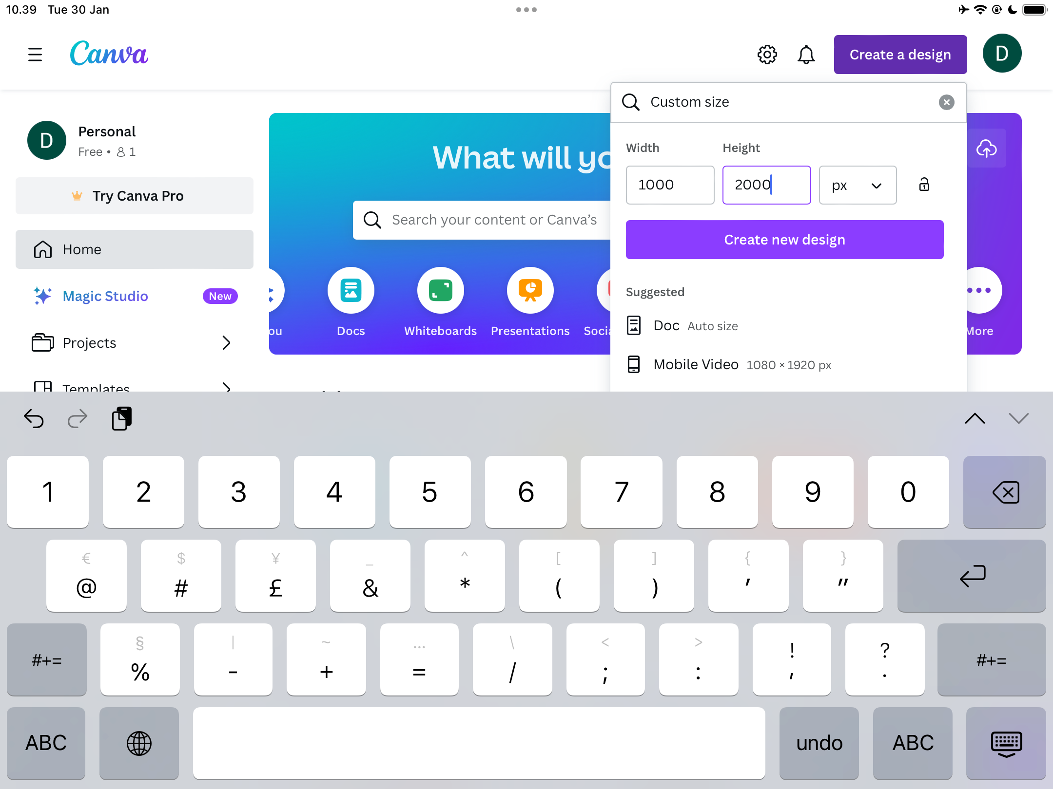
You can use the default dimensions for numerous platforms in the Canva app, including Instagram Stories, Facebook posts, and snaps on Snapchat. The easiest way to do this is by searching for them on the homepage.
If you have default dimensions that don’t appear as a pre-designed template, it’s possible to create your own custom ones as well. For example, if you need to create a blog image, you can resize based on the dimensions for each website you publish on.
6 Utilizing Complementary Fonts
If you haven’t got much experience in design, it’s easy to overlook the importance of how fonts interact with each other. With this in mind, an easy way to make your Canva designs pop is to use complimentary fonts. You’ll need to experiment a bit as it’s not always clear straight away.
My advice here is to try different font combinations in Canva and see what works best for you. Doing this can be quite difficult because the fonts you see in Canva aren’t always the same as what is common elsewhere. You can start by taking a look at these free Canva fonts to use in your designs and presentations.
7 Using the “Photo Colors” Feature
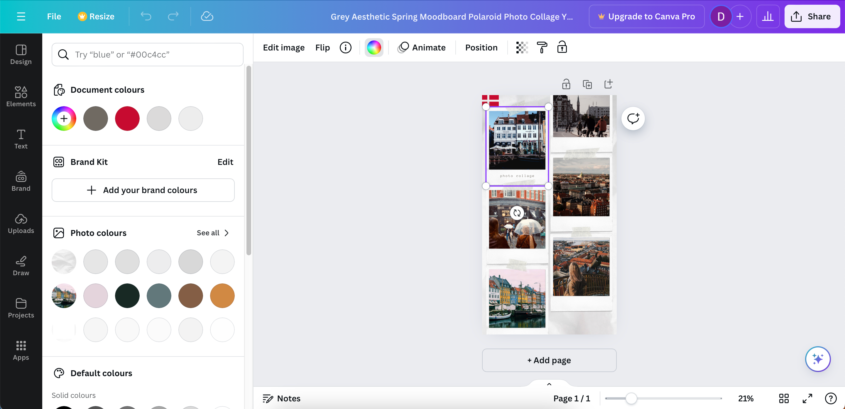
Picking complementary colors is difficult even if you have an understanding of design, photography, or any other visual field. However, the Photo Colors feature is an absolute game-changer if you’re using Canva. This tool will assess the images in your design and find complementary colors for you. You can then use these in your text, backgrounds, and other interactive elements.
To access this feature:
- Select an image in your design.
- Tap the colorful wheel icon.
- Look through the colors in Photo colors and experiment to see which combinations work best for you.
You can also use Canva’s Brand Kit feature for better color combinations if you have a Canva Pro subscription.
8 Using Elements Sparingly
Another simple way to make your designs stand out in Canva is by only using a few core elements. Adding too much to your design will inevitably make everything look sloppy, and it’ll become harder for viewers to know what they should focus on.
I don’t have a one-size-fits-all rule here; it depends on your design and personal taste. However, I would recommend using a minimalist approach. If it doesn’t make sense for you to add something to your design, it’s best to leave it out altogether.
Canva is quite an easy tool to learn, and you can do several things to make your designs immediately stand out. From adopting the Photo Colors feature to understanding how different fonts work together, implementing what you’ve learned here will give you a good starting point.

